A landing page is a standalone page that is designed to persuade visitors to take a specific action, such as filling out a form. It’s a a web page that serves as the entry point to a website or a particular section of a website. Landing pages typically have a clear and focused message, a call-to-action (CTA), and are optimised for lead generation or sales.
Landing pages are often used together with Ads campaigns, such as Google Ads or social media Ads, to provide a targeted experience that is tailored to the ad’s message and audience. In affiliate marketing, it’s where your visitors land when they follow an external link to your site.
Whats the Purpose of the Landing Page?
The concept of landing pages date back to the direct response marketing campaigns especially traditional print ads for maximum conversion. They have since graduated for application across all digital marketing channels.
The main purpose of the landing page is to persuade the visitors to complete a predetermined action. As such, it’s a critical parameter in content design and Search Engine Optimization (SEO). It is therefore a key strategy to capture organic search traffic.
Landing Page vs. Homepage
Is landing page the same as home page? Not necessarily. Unless it’s a one-page website e.g. created specifically for sign-ups, the two are different.They are designed with completely different goals in mind.

Take an example of a large business mall with many shops, eateries and other businesses such as banks. The homepage is likely to be the mall’s reception area while the landing page is the individual shop or bank (destination). The homepage of your site sets the stage while the landing page allows visitors to accomplish a specific goal.
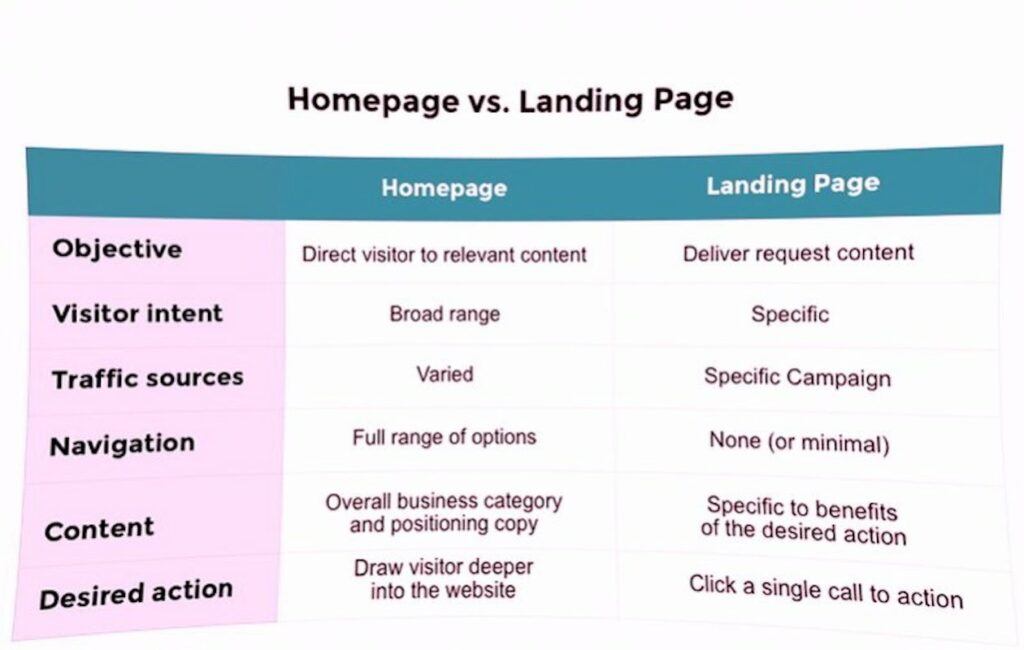
You can also view the home page as the front cover of a book while the landing page is like a special-offer leaflet inserted in the book. In terms of design the landing page has limited navigation options. Homepage offers you multiple links and points of entry. The intent of the homepage is more of directing to another destination while the landing page has a high commercial intent.
Difference Between Home Page and Landing Page
In a nutshell, the following are the major areas of differences between landing pages and home pages;
- Design – Landing pages are designed with a solitary goal in mind with a simple and uncluttered design highlighting the offer and the call-to-action. Conversely. home pages are often prominent in visuals and include multiple sections and links to other pages on the site.
- Messaging – Landing pages have a clear and focused message that speaks directly to the audience’s concerns with solution. Home pages offer a broad overview of the site’s offerings with a more general message.
- Navigation – Navigation in landing pages is typically is minimal or non-existent to reduce distractions and keep the focus on the offer and the call-to-action. In contrast, home pages have a more extensive navigation menu that helps visitors find the information they are looking for.
- Traffic source – Landing pages are often used in conjunction with Ads campaigns and are designed to provide a targeted experience for visitors who click on a specific ad. Home pages, on the other hand, are the main entry point for visitors who come to the site through organic search.
- Conversion rate – Landing pages are designed to optimise conversions by providing a clear and compelling offer and a single call-to-action. Home pages, on the other hand, are designed to provide visitors with a broad overview of the site’s offerings and may have multiple calls-to-action that encourage visitors to explore the site further.
What’s an Affiliate Landing Page?
An affiliate landing page is a type of landing page that is designed specifically for affiliate business. It’s a dedicated webpage that the affiliate sends their traffic to, which promotes the merchant’s products or services. The goal of an affiliate landing page is to convince visitors to click through to the merchant’s website and make a purchase, in order to earn a commission for the affiliate.
As an affiliate, you must ensure that your landing page provide valuable information to your visitors so that they get convinced to take action by clicking through to the merchant’s website.
Structure of a Landing Page
Landing pages can be as different as their visitors. Each of them has a different reader, a different call to action, a different niche, a different product or service to promote making it difficult to design a one-size-fits-all template. However, the following elements are common in majority of successful landing pages;
- Main proposition/Offer
- CTA (Call-To-Action)
- Benefits
- Social proof
The Proposition/Offer
On opening the page, this is the main message you see as a visitor. It’s the statement that inform the visitor of the offer or product proposition. It must therefore be concise, clear and strongly enumerate the message to attract the attention of the visitors.
To avoid making it too long, the main proposition is often supported by a subheading that reinforces the main message. You could think of this as the killer punch, a final pitch to persuade the visitor to stay.
Are example below is an example Bluehost Page, a leading company in web hosting and other services. ‘Up to 70% off on hosting for WordPress Websites and Stores’ phrase is the main proposition

Call To Action (CTA)
The ultimate goal of the landing page is to entice the visitor to perform some predetermined actions (CTA). CTA is therefore the end result and the main goal of a digital marketer. Due to its criticl role in creating conversions, a lot of emphasis must be put in its design and placement. It should also be convincing, stimulating and persuasive at first sight.
Below is an example of Wealthy Affiliate’s landing page a leading affiliate programs landing page. The CTA is to create an account by providing an email address.

Benefits
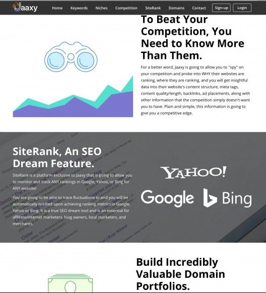
This is where you give a breakdown of the benefits that visitors will get from your proposition. Although it tends to be detailed, it always prudent to offer a summary of these benefits and features for clarity. Belwo is an example indicated in the landing page of Jaaxy, a keyword research tool.

Social Proof
Social Proof is defined as a social and psychological situation where one copies another person’s behavior. When you shop online, the normal tendency is to read through recommendations from past customers, product reviews, ratings, testimonials and validation from trustworthy sources before making your decision.
Social proof shapes consumer behavior through imitation, conformity and consensus. It is very effective in persuading potential customers who are likely to become customers if they read endorsement of your offer from others. An example is shown below for Wealthy Affiliate’s landing page.

How do you Optimise a Landing Page?
Since you have spent money on that paid ad, you must ensure that when the visitor finally reaches on your landing page, you have the best offer to stand a chance of benefiting from that customer. Ideally, a landing page should have limited navigation and reduced options which can deviate your visitor away from the targeted action.
The following best practices will enable you achieve a powerful landing page;
Focus on particular goal

The idea here is to be very specific with what action you want the visitor to perform once they land. If you include too many call-to-actions or links to other pages, you leave the visitor with the discretion to decide which action to perform first which may conflict with your target.
The CTA should be repeated as often as you scroll down the page and presented as the only option for the visitor to do in the page. Every element in the page must be in the support of the CTA. In addition, consider allocating one target per landing page
The offer should always be above the fold
Due to the nature of ordinary web visitors to only skim through for Keywords, the landing page should always be aligned with the source. If the page originated from a paid ad, then there should be a direct connection between the two otherwise the visitor may opt out trying to connect the two.
The landing page MUST load fast
This aspect is not negotiable. You must strive to eliminate bounce rate by investing on fast-loading landing page to enhance conversion rates.
Proof from other customers
Online visitors always looking for justification of their decisions. As such proof from existing customers is a vital aspect of landing page success. A customer or industry review rating can also act as an endorsement of your offer.
Invest in customer experience

We’re living in a visual world. Majority of online customers consider images the most important factor in their decision to make an online purchase – more important than product descriptions, reviews, or even price. You must therefore invest in an eye-appealing landing page. The CTA must be the most visually conspicuous element on the page. Color, size or design of the CTA and the page at large must always be made to stand out to draw attention of the potential customers.
A landing page is a place where people buy, customer click, and you make money. Its the place where your efforts finally come to fruition. In addition to the above, conducting A/B testing of your landing pages will enable you to see how your audience will respond to different versions of the page. Ultimately you want to end up with the landing page that’s most appealing to your audience to end up in a conversion.
Jeff
Safari Affiliate
